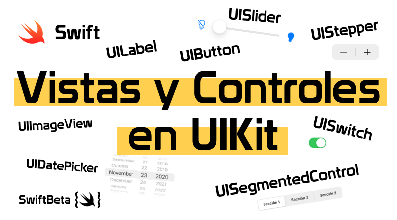
Vistas y Controles en UIKit
Hoy vamos a ver 9 componentes que usamos de forma nativa en nuestra aplicaciones iOS. Las vistas y controles de este post está creadas por código: UIButton, UILabel, UIImageView, UITextView, etc
Tabla de contenido
En el post de hoy vamos a ver los componentes más usados en UIKit. Por si no lo sabes, UIKit es un framework de Apple para construir y manejar interfaces de usuario para aplicaciones iOS o tvOS.
Todos los componentes que verás a continuación tienen su ejemplo en código para que entiendas como funcionan a bajo nivel. Puedes ver todo el código y ejecutar los playgrounds en nuestro repositorio de Github.
Las vistas y controles que vamos a ver son:
| UILabel | UIButton | UIImageView |
| UITextView | UISwitch | UISlider |
| UIStepper | UISegmentedControl | UIDatePicker |
UILabel en Swift
Vista que muestra una o más líneas con texto.

final class MyViewController: UIViewController {
    private var myLabel: UILabel = {
        let label = UILabel()
        label.frame = CGRect(x: 85, y: 200, width: 200, height: 40)
        label.text = "UILabel in Swift"
        return label
    }()

    override func loadView() {
        let view = UIView()
        view.backgroundColor = .white

        view.addSubview(myLabel)
        self.view = view

        updateLabelProperties()
    }

    func updateLabelProperties() {
        myLabel.numberOfLines = 4
        myLabel.backgroundColor = .blue
        myLabel.font = .systemFont(ofSize: 20)
        myLabel.textAlignment = .center
        myLabel.textColor = .white
    }
}

// Present the view controller in the Live View window
PlaygroundPage.current.liveView = MyViewController()
UILabel es uno de los componentes más usados en las aplicaciones. Su misión es informar al usuario mediante un texto. En el método updateLabelProperties() hemos modificado algunas de sus propiedades:
| text | Texto que queremos mostrar en nuestro UILabel. |
| numberOfLines | Podemos indicar el número máximo de líneas de nuestro UILabel (por defecto es 1). Si queremos que sea infinito solo debemos asignar 0. |
| backgroundColor | Podemos cambiar el color del background de nuestro UILabel. |
| font | Esta propiedad es para cambiar la fuente, podemos usar la del sistema o fuentes propias. |
| textAlignment | Podemos alinear el texto a la izquierda, derecha, centrado, justificado o natural (.left, .right, .center, .justified o .natural). |
| textColor | Podemos cambiar el color del texto. |
UIButton en Swift
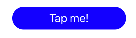
Cuando usamos un UIButton es para que el usuario haga alguna interacción con él y por lo tanto se realice alguna acción.
final class MyViewController : UIViewController {
    private var myButton: UIButton = {
        let button = UIButton(type: .system)
        button.frame = CGRect(x: 85, y: 200, width: 200, height: 40)
        button.setTitle("Tap me!", for: .normal)
        button.addTarget(self, action: #selector(didTapOnButton), for: .touchUpInside)
        return button
    }()

    override func loadView() {
        let view = UIView()
        view.backgroundColor = .white

        view.addSubview(myButton)
        self.view = view

        updateButtonProperties()
    }

    @objc private func didTapOnButton() {
        print("Did tap on button")
    }

    func updateButtonProperties() {
        myButton.setTitleColor(.white, for: .normal)
        myButton.backgroundColor = .blue
        myButton.titleLabel?.font = .systemFont(ofSize: 20)
        myButton.layer.cornerRadius = 20
    }
}

// Present the view controller in the Live View window
PlaygroundPage.current.liveView = MyViewController()
Fíjate que al crear el UIButton podemos escoger entre distintos tipos, en nuestro caso hemos escogido .system.
Puedes cambiar por uno de los siguientes tipos para ver cómo cambia el diseño del botón:
| UIButton.ButtonType | ||
| custom | system | detailDisclosure |
| infoLight | infoDark | contactAdd |
| plain | close |
Propiedades y métodos que debes tener en cuenta al crear un UIButton:
| setTitle | Al usar setTitle especificamos un título al UIButton en un estado en concreto. Podemos encontrar distintos estados: normal, hightlighted, disable, selected, etc |
| addTarget | Con este método indicamos que método queremos que se ejecute al pulsar el botón. Hay distintos tipos de triggers, en nuestro caso hemos especificado que se llame al método cuando se pulse en el botón: .touchUpInside |
| setTitleColor | Otro método para cambiar el color del texto del botón, aquí también podemos especificar qué color queremos para los distintos estados: normal, hightlighted, disable, selected, etc |
| backgroundColor | También podemos cambiar el color del background de nuestro botón |
| titleLabel?.font | Esta propiedad es para cambiar la fuente, podemos usar la del sistema o fuentes propias. |
| layer.cornerRadius | Al modificar el cornerRadius de la propiedad layer, obtenemos el efecto de esquinas redondeadas. |
UIImageView en Swift
Un objeto que muestra una única imagen. En este caso hemos añadido una imagen del sistema que representa un calendario.

final class MyViewController: UIViewController {
    private var myImageView: UIImageView = {
        let imageView = UIImageView()
        imageView.frame = CGRect(x: 85, y: 200, width: 200, height: 40)
        return imageView
    }()

    override func loadView() {
        let view = UIView()
        view.backgroundColor = .white

        view.addSubview(myImageView)
        self.view = view

        updateImageViewProperties()
    }

    func updateImageViewProperties() {
        let image = UIImage(systemName: "calendar")
        myImageView.image = image
        myImageView.contentMode = .scaleAspectFit
        myImageView.backgroundColor = .red
        myImageView.tintColor = .white
    }
}
// Present the view controller in the Live View window
PlaygroundPage.current.liveView = MyViewController()
Propiedades y métodos que debes tener en cuenta al crear un UIImageView:
| image | Imagen que se dibujará dentro del UIImageView |
| contentMode | Depende como queramos mostrar la imagen en nuestro UIImageView, podemos usar distintas opciones: scaleToFill, scaleAspectFit, scaleAspectFill, redraw, center, top, bottom, left, right, topLeft, topRight, bottomLeft y bottomRight. Prueba a cambiar el contentMode y observa como se ajusta la imagen al tamaño de UIImageView. |
| backgroundColor | También podemos cambiar el color del background de nuestro UIImageView |
| tintColor | Para cambiar el color de la imagen, en este caso cambia a blanco. |
UITextView en Swift
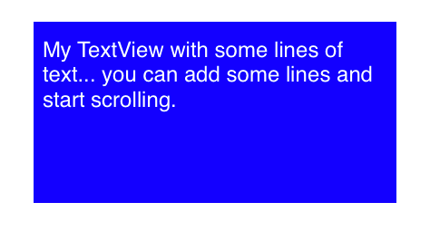
Es como un UILabel pero puedes editar texto y tiene scroll.
final class MyViewController : UIViewController {
    var myTextView: UITextView = {
        let textView = UITextView()
        textView.frame = CGRect(x: 85, y: 200, width: 200, height: 100)
        textView.text = "My TextView with some lines of text... you can add some lines and start scrolling."
        return textView
    }()

    override func loadView() {
        let view = UIView()
        view.backgroundColor = .white

        view.addSubview(myTextView)
        self.view = view

        updateTextViewProperties()
    }

    func updateTextViewProperties() {
        myTextView.textColor = .white
        myTextView.backgroundColor = .blue
        myTextView.textAlignment = .left
    }
}
// Present the view controller in the Live View window
PlaygroundPage.current.liveView = MyViewController()
Propiedas a tener en cuenta:
| text | Texto que quieres añadir a tu UITextView |
| textColor | Color del texto |
| backgroundColor | También podemos cambiar el color del background de nuestro UITextView |
| textAlignment | Podemos alinear el texto a la izquierda, derecha, centrado, justificado o natural (.left, .right, .center, .justified o .natural). |
UISwitch en Swift
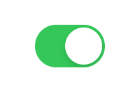
Control que nos ofrece una opción binaria, encendido o apagado.
final class MyViewController : UIViewController {
    private var mySwitch: UISwitch = {
        let uiSwitch = UISwitch()
        uiSwitch.frame = CGRect(x: 85, y: 200, width: 200, height: 40)
        uiSwitch.addTarget(self, action: #selector(didTapOnSwitch), for: .valueChanged)
        return uiSwitch
    }()

    override func loadView() {
        let view = UIView()
        view.backgroundColor = .white

        view.addSubview(mySwitch)
        self.view = view
    }

    @objc private func didTapOnSwitch() {
        if mySwitch.isOn {
            print("Switch: On")
        } else {
            print("Switch: Off")
        }
    }
}

// Present the view controller in the Live View window
PlaygroundPage.current.liveView = MyViewController()
Propiedades y métodos a tener en cuenta:
| addTarget | Con este método indicamos que método queremos que se ejecute al cambiar de valor en el UISwitch. Hay distintos tipos de triggers, en nuestro caso hemos especificado que se llame al método cuando se cambie el valor: .valueChanged |
| isOn | Variable que nos indica si el UISwitch está activado o desactivado. |
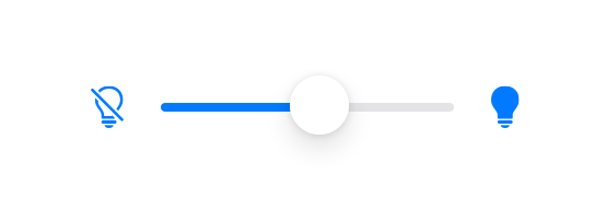
UISlider en Swift
Control que nos proporciona seleccionar un valor entre un rango de valores.
final class MyViewController : UIViewController {
    private var mySlider: UISlider = {
        let slider = UISlider()
        slider.frame = CGRect(x: 85, y: 200, width: 200, height: 40)
        slider.minimumValue = 0
        slider.maximumValue = 10
        slider.addTarget(self, action: #selector(didMoveSlider), for: .valueChanged)
        slider.minimumValueImage = UIImage(systemName: "lightbulb.slash")
        slider.maximumValueImage = UIImage(systemName: "lightbulb.fill")
        return slider
    }()

    override func loadView() {
        let view = UIView()
        view.backgroundColor = .white

        view.addSubview(mySlider)
        self.view = view
    }

    @objc private func didMoveSlider(sender: UISlider) {
        print("Slider Value: \(sender.value)")
    }
}

// Present the view controller in the Live View window
PlaygroundPage.current.liveView = MyViewController()
Propiedades y métodos a tener en cuenta:
| minimumValue | Valor mínimo que podremos seleccionar en nuestro rango. |
| maximumValue | Valor máximo que podremos selecciona en nuestro rango. |
| addTarget | Con este método indicamos que método queremos que se ejecute al cambiar de valor en el UISlider. Hay distintos tipos de triggers, en nuestro caso hemos especificado que se llame al método cuando se cambie el valor: .valueChanged. |
| minimumValueImage | Imagen que estará en el lado de nuestro valor mínimo. |
| maximumValueImage | Imagen que estará en el lado de nuestro valor máximo. |
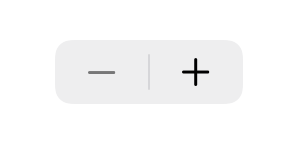
UIStepper en Swift
Control para aumentar o decrementar un valor.
import Foundation
import UIKit
import PlaygroundSupport


final class MyViewController: UIViewController {
    private var myStepper: UIStepper = {
        let stepper = UIStepper()
        stepper.frame = CGRect(x: 85, y: 200, width: 200, height: 40)
        stepper.minimumValue = 0
        stepper.maximumValue = 20
        stepper.addTarget(self, action: #selector(didChangeStepper), for: .valueChanged)
        return stepper
    }()

    override func loadView() {
        let view = UIView()
        view.backgroundColor = .white

        view.addSubview(myStepper)
        self.view = view
    }

    @objc private func didChangeStepper(sender: UIStepper) {
        print("Stepper Value: \(sender.value)")
    }
}
// Present the view controller in the Live View window
PlaygroundPage.current.liveView = MyViewController()
Propiedades y métodos a tener en cuenta:
| minimumValue | Valor mínimo que podremos asignar a nuestro UIStepper. |
| maximumValue | Valor máximo que podremos asignar en nuestro UIStepper. |
| addTarget | Con este método indicamos que método queremos que se ejecute al cambiar de valor en el UIStepper. Hay distintos tipos de triggers, en nuestro caso hemos especificado que se llame al método cuando se cambie el valor: .valueChanged. |
| value | Valor de nuestro UIStepper. |
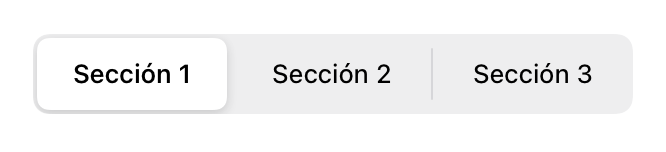
UISegmentedControl en Swift
Control horizontal que consiste de múltiples segmentos, cada uno con su propio botón.
final class MyViewController: UIViewController {
    private var mySegmentedControl: UISegmentedControl = {
        let segmentedControl = UISegmentedControl(items: ["Sección 1", "Sección 2", "Sección 3"])
        segmentedControl.frame = CGRect(x: 40, y: 200, width: 300, height: 40)
        segmentedControl.selectedSegmentIndex = 0
        segmentedControl.addTarget(self, action: #selector(didChangeSegmentedControl), for: .valueChanged)
        return segmentedControl
    }()

    override func loadView() {
        let view = UIView()
        view.backgroundColor = .white

        view.addSubview(mySegmentedControl)
        self.view = view
    }

    @objc private func didChangeSegmentedControl(sender: UISegmentedControl) {
        print("UISegmentedControl Value: \(sender.selectedSegmentIndex)")
    }
}
// Present the view controller in the Live View window
PlaygroundPage.current.liveView = MyViewController()
Propiedades y métodos a tener en cuenta:
| selectedSegmentIndex | Segmento que queremos que esté seleccionado. En este caso hemos puesto 0, queremos que al cargar la vista la primera opción esté seleccionada. |
| addTarget | Con este método indicamos que método queremos que se ejecute al cambiar de valor en el UISegmentedControl. Hay distintos tipos de triggers, en nuestro caso hemos especificado que se llame al método cuando se cambie el valor: .valueChanged. |
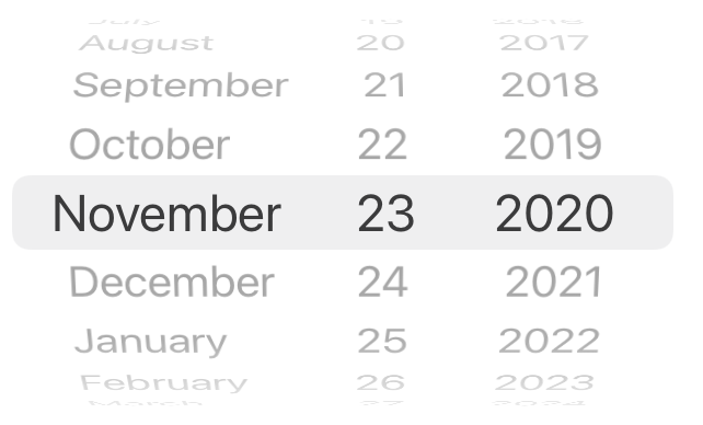
UIDatePicker en Swift
Control para meter fechas o tiempo.
final class MyViewController: UIViewController {
    private var myDatePicker: UIDatePicker = {
        let datePicker = UIDatePicker()
        datePicker.datePickerMode = .date
        datePicker.addTarget(self, action: #selector(didChangeDateValue), for: .valueChanged)
        return datePicker
    }()

    override func loadView() {
        let view = UIView()
        view.backgroundColor = .white

        view.addSubview(myDatePicker)
        self.view = view
    }

    @objc private func didChangeDateValue(sender: UIDatePicker) {
        print("Date Value: \(sender.date)")
    }
}
// Present the view controller in the Live View window
PlaygroundPage.current.liveView = MyViewController()
Propiedades y métodos a tener en cuenta:
| datePickerMode | Depende lo que queremos mostrar, podemos escoger: time, date, dateAndTime o countDownTimer. |
| addTarget | Con este método indicamos que método queremos que se ejecute al cambiar de valor en el UIDatePicker. Hay distintos tipos de triggers, en nuestro caso hemos especificado que se llame al método cuando se cambie el valor: .valueChanged. |
Hoy hemos dado una pincelada a algunos elementos que podemos usar al construir nuestras vistas con UIKit, espero que te haya servido de utilidad ver qué componentes usar de forma nativa.


